How to Attract Customers in a Visually Competitive Marketplace

Customers don’t browse; they skim. In moments, your visuals have to spark interest, make the offer clear, and feel unmistakably “you.” The brands that win attention do four things well: design with intention, stay visually consistent, use crisp, authentic imagery, and tell short, engaging stories.
Key Takeaways
● Pick a simple, distinctive look and repeat it everywhere.
● Use high-quality, authentic photos and clear focal points.
● Keep layouts clean; use contrast to guide the eye.
● Tell short visual stories (carousels, quick cuts, before/after).
● Make backgrounds work for you, not against you.
The Foundation: Eye-Catching Design That’s Easy to Read
Clarity beats clutter. Strong contrast, clear hierarchy, and generous spacing help people instantly understand what matters most. For practical guidance on hierarchy that improves scannability, see Nielsen Norman Group’s primer on visual hierarchy.
Fast Wins for Attention
● Use one dominant focal point per frame.
● Limit palettes (3–5 colors) to avoid noise.
● Reserve bold colors for calls-to-action, not everything.
● Keep margins and line spacing consistent.
Consistent Branding Builds Recognition
Recognition compounds when your look doesn’t drift between channels. Create a small “visual system” you can stamp across web, social, and print.
Brand Consistency Checklist
● Same color palette on every platform
● Fixed set of typefaces (2–3 max)
● Repeatable layouts and grid spacing
● Standard treatments for icons/illustrations
● Versioned templates for common posts
Use a contrast standard so your colors stay legible everywhere. TheWebAIM Contrast Checker makes it easy to validate text and UI elements.
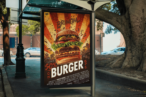
High-Quality Imagery People Trust
Real beats staged. Natural light, true-to-life settings, and authentic expressions outperform generic stock. If you need stock, choose libraries with clear, permissive licenses (review Unsplash’s license for what’s allowed).
Image Quality Quick Fixes (Bulleted)
● Shoot near windows or outdoors for soft light
● Fill the frame; avoid busy backgrounds
● Keep horizon lines straight
● Edit lightly—avoid over-saturation
● Export at platform-appropriate sizes
Engaging Visual Content: Make It Move (Just Enough)
Short motion catches the eye and communicates fast. Think 5- to 15-second clips, step-by-step carousels, or subtle micro-animations on key buttons. For ad creative structure that’s proven to hold attention, see the ABCDs framework on Think with Google.
Build a Scroll-Stopping Visual (Step-by-Step)
Pick one message. Write the single takeaway you want viewers to remember.
Choose a focal image. A person, product hero, or bold headline—only one star.
Set contrast. Use a dark-on-light or light-on-dark scheme; verify with WebAIM.
Create hierarchy. H1 headline → brief subhead → one action button.
Tame the background. Keep it quiet so the focal point shines (see next section).
Export for the channel. Match dimensions per Hootsuite’s size guide.
Add alt text. Clear, helpful descriptions improve accessibility and reach (see W3C image tutorials).
Make Backgrounds Do the Heavy Lifting
Backgrounds can frame your subject, direct attention, and make your brand instantly recognizable. Choosing low-noise textures, on-brand gradients, or subtle color fields helps the main elements pop while reinforcing your visual identity. A tool for background design lets you craft custom backdrops from photos or templates and personalize them with text and graphics—so your visuals feel cohesive without overwhelming the message.
| Problem in the Visual | What to Change | Why it Works |
|---|---|---|
| Too many competing elements | Keep one focal point; reduce on-slide text | Eliminates cognitive overload |
| Low legibility | Increase contrast; simplify background | Improves instant readability |
| Feels off-brand | Apply standard colors/type; reuse templates | Builds recognition and trust |
| Looks “stocky” | Use authentic images; light retouching | Feels real, boosts credibility |
| Gets ignored in-feed | Add subtle motion or a punchy opener | Interrupts scrolling patterns |
FAQs
Q: How often should we refresh our visuals?
Every 18–24 months—or sooner if metrics (CTR, watch time) slide.
Q: Do we need professional photography?
Helpful, not mandatory. Good light + consistent framing + careful editing can beat a pricey shoot.
Q: How much text belongs on an image?
As little as possible. Headline + short subhead. Push details to captions or landing pages.
Q: Should visuals change by platform?
Yes in format (sizes/lengths), no in identity (colors/type/voice).
Q: Are accessibility steps worth the effort?
Absolutely. Clear contrast and alt text help more people engage and can improve distribution signals.
Micro-Checklists You Can Reuse
Pre-Publish Design Check
Before posting or sending any visual live, confirm:
● The visual communicates one clear message
● There’s one strong focal point (no competing elements)
● The background is clean and non-distracting
● A clear CTA (Call-to-Action) is visible and legible
● Contrast meets accessibility standards for readability
Brand Fit Check
To maintain visual consistency across all assets:
● Colors match your approved palette
● Typography follows brand standards (2–3 fonts max)
● Layouts align with established templates or grids
● Iconography and visual accents share a uniform style
Channel Fit Check
To ensure the visual performs well on each platform:
● Image or video is sized correctly for its target platform
● Safe margins are observed (no text near edges)
● The file appears crisp at 2× display resolution (DPR)
● Captions and surrounding copy reinforce the visual message
Product Spotlight
Want a fast way to define and test on-brand color systems? Coolors generates palette options you can fine-tune, lock hues you love, and export codes to your brand kit—handy for keeping social, web, and print aligned.
Glossary
● Brand Kit — Your official colors, typefaces, and visual rules.
● Contrast — Light/dark difference that makes text and elements readable.
● Focal Point — The element designed to grab first attention.
● Hierarchy — The order in which eyes should read elements.
● Template — A repeatable layout that speeds production and preserves consistency.
Conclusion
Winning the visual battle isn’t about shouting, it’s about clarity and consistency. Use focused design, authentic imagery, intentional backgrounds, and bite-sized stories. When every element has a job and your look is repeatable, customers notice—and remember.
Don Lewis
Don Lewis created Ability Labs to help family members of people with disabilities. When Don’s son, Randy, was a junior in college he was in a terrible motorcycle accident and suffered a severe head trauma among many other injuries. From that day on, Randy’s physical and cognitive abilities have changed, but he’s still Don’s favorite person in the world. Through Randy’s journey, Don has learned a lot about how different life is for people who are differently-abled. Don believes that everyone is special and no one should be defined by their unique abilities. He hopes Ability Labs will inspire others to promote or even adopt this way of thinking.


Share in the comments below: Questions go here